Introduction to GUIs
https://www.udemy.com/complete-python-bootcamp/learn/lecture/3547984#questions
Welcome to the bonus GUI Section of this course!
All notebooks associated with this section are located under the GUI folder in the NbViewer or Github repository containing the course notebooks.
There are many,many Graphical User Interface options for Python users.
- Here is the link to the documentation concerning the most common GUI frameworks.
- For a full list of all available GUI frameworks, check out the Full GUI Programming List
It’s important to remember that no framework is objectively better than all the others, and different use cases will require different frameworks. For instance, if you want to begin GUIs by designing a graphical game, your best bet would be PyGame! (The link provided directs you to there learning page).
If you want to build web apps, you’ll probably want to avoid Python as the GUI and use it for backend work using Flask or Django instead. With web apps you’ll want to explore HTML,CSS, and Javascript to provide the GUI for your user.
For the rest of this section we will explore the awesome world of Widgets in the Jupyter Notebook setting! This type of GUI is best suited for creating dashboards for data/business analysis situations.
Let’s get started!
Quick Note about Ipywidgets
Hi everyone!
Just a quick note about coloring and styling your ipywidgets, ipywidgets has actually switched over to a Bootstrap style, for more info, check out:
https://ipywidgets.readthedocs.io/en/latest/examples/Widget%20Styling.html#Predefined-styles
Any questions? Feel free to post to the QA forums, thanks!
Interactive Functionality with GUIs
https://www.udemy.com/complete-python-bootcamp/learn/lecture/9523220#questions
Note: If using the notebooks included with the class, you must download them from GitHub and run them in Jupiter Notebooks in order to see the functionality.
Import the widgets
# Start with some imports!
from ipywidgets import interact, interactive, fixed
import ipywidgets as widgets
Interact auto generates basic user functions for interactive controls.
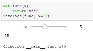
Integers
def func(x):
    return x
interact(func, x=10)
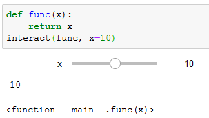
Change the function to return the square of x and see how the return value changes.
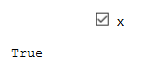
Boolean
def func(x):
    return x
interact(func, x=True)
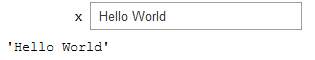
Strings
def func(x):
    return x
interact(func, x='Hello World')
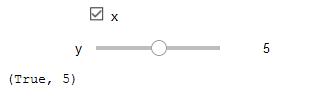
Using Decorators
@interact(x=True, y=5)
def myfunc(x, y):
    return (x,y)
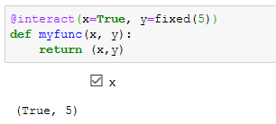
Passing ‘Fixed’ (non-user editable) valules
@interact(x=True, y=fixed(5))
def myfunc(x, y):
    return (x,y)
Widget Abbreviations
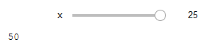
Changing the slider parameters
By default, the slider min = -x and max = x*3
def myfunc(x):
    return x
interact(myfunc, x=widgets.IntSlider(min=0, max=25, step=5, value=10))
To abbreviate this, set x to a tuple in the same order:
def myfunc(x):
    return x
interact(myfunc, x=(0, 25, 5))
This fails if you try to also pass in a default value!!
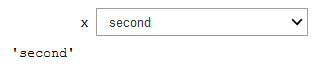
Dropdown Menus
Lists
Just pass in a list
def myfunc(x):
return x
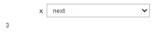
interact(myfunc, x=['first', 'second','next'])
Dictionaries
Note: These return the value and display the keys!
def myfunc(x):
    return x
interact(myfunc, x={'first':1, 'second':2,'next':3})
Interactive
Allows you to use values from existing controls.
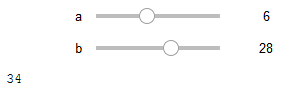
from IPython.display import display
def f(a, b):
    display(a+b)
    return a+b

w = interactive(f, a=10, b=20)
type(w)
ipywidgets.widgets.interaction.interactive
w.children
(IntSlider(value=10, description=’a’, max=30, min=-10),
IntSlider(value=20, description=’b’, max=60, min=-20),
Output())
two IntSliders and one Output
Run the function
display(w)
GUI Widget Basics
https://www.udemy.com/complete-python-bootcamp/learn/lecture/9523224#questions
import ipywidgets as widgets
Common Widgets
IntSlider
widgets.IntSlider()
Shows the widget
To display later:
from IPython.display import display
w = widgets.IntSlider()
display(w)
Close a widget
w.close()
view widget parameters
w.keys
Get and Set a Widget value
Example:
print(w.value)
22
w.value = 44
The widget will self adjust to the new value.
Note: Many widget values can be adjusted on the fly: max, min, step, value, etc.
Linking Widgets
a = widgets.FloatText()
display(a)
– shows a text box –
a = widgets.FloatText()
b = widget.FloatSlider()
display(a, b)
– shows a text box –
– shows a slider –
Each of these widgets are independant
To link these two…
Note:jslink = JavaScript Link
a = widgets.FloatText()
b = widget.FloatSlider()
display(a, b)
mylink = widgets.jslink( (a,'value'), (b,'value))
Different values can be linked, such as the value of one to the max of another.
Unlinking
mylink.unlink()
Widgets List
https://www.udemy.com/complete-python-bootcamp/learn/lecture/9523228#questions
Show all widgets
import ipywidgets as widgets

# Show all available widgets!
for item in widgets.Widget.widget_types.items():
    print(item[0][2][:-5])
Layout
Accordion
Audio
BoundedFloatText
BoundedIntText
Box
Button
ButtonStyle
Checkbox
ColorPicker
ControllerAxis
ControllerButton
Controller
DOMWidget
DatePicker
DescriptionStyle
DirectionalLink
Dropdown
FloatLogSlider
FloatProgress
FloatRangeSlider
FloatSlider
FloatText
GridBox
HBox
HTMLMath
HTML
Image
IntProgress
IntRangeSlider
IntSlider
IntText
Label
Link
Password
Play
ProgressStyle
RadioButtons
Select
SelectMultiple
SelectionRangeSlider
SelectionSlider
SliderStyle
Tab
Text
Textarea
ToggleButton
ToggleButtons
ToggleButtonsStyle
VBox
Valid
Video
Output
Numeric
IntSlider
widgets.IntSlider(
    value=7,
    min=0,
    max=10,
    step=1,
    description='Test:',
    disabled=False,
    continuous_update=False,
    orientation='horizontal',
    readout=True,
    readout_format='d'
)
FloatSlider
widgets.FloatSlider(
    value=7.5,
    min=0,
    max=10.0,
    step=0.1,
    description='Test:',
    disabled=False,
    continuous_update=False,
    orientation='horizontal',
    readout=True,
    readout_format='.1f',
)
Sliders can be displayed vertically!
orientation='vertical',
IntRangeSlider
widgets.IntRangeSlider(
    value=[5, 7],
    min=0,
    max=10,
    step=1,
    description='Test:',
    disabled=False,
    continuous_update=False,
    orientation='horizontal',
    readout=True,
    readout_format='d',
)
FloatRangeSlider
widgets.FloatRangeSlider(
    value=[5, 7.5],
    min=0,
    max=10.0,
    step=0.1,
    description='Test:',
    disabled=False,
    continuous_update=False,
    orientation='horizontal',
    readout=True,
    readout_format='.1f',
)
IntProgress
widgets.IntProgress(
    value=7,
    min=0,
    max=10,
    step=1,
    description='Loading:',
    bar_style='', # 'success', 'info', 'warning', 'danger' or ''
    orientation='horizontal'
)
FloatProgress
widgets.FloatProgress(
    value=7.5,
    min=0,
    max=10.0,
    step=0.1,
    description='Loading:',
    bar_style='info',
    orientation='horizontal'
)
BoundedIntText
widgets.BoundedIntText(
    value=7,
    min=0,
    max=10,
    step=1,
    description='Text:',
    disabled=False
)
BoundedFloatText
widgets.BoundedFloatText(
    value=7.5,
    min=0,
    max=10.0,
    step=0.1,
    description='Text:',
    disabled=False
)
IntText
widgets.IntText(
    value=7,
    description='Any:',
    disabled=False
)
FloatText
widgets.FloatText(
    value=7.5,
    description='Any:',
    disabled=False
)
Boolean Widgets
ToggleButton
widgets.ToggleButton(
    value=False,
    description='Click me',
    disabled=False,
    button_style='', # 'success', 'info', 'warning', 'danger' or ''
    tooltip='Description',
    icon='check'
)
Checkbox
widgets.Checkbox(
    value=False,
    description='Check me',
    disabled=False
)
Valid
Read Only indicator
widgets.Valid(
    value=False,
    description='Valid!',
)
Selection Widgets
There are several widgets that can be used to display single selection lists, and two that can be used to select multiple values. All inherit from the same base class. You can specify the enumeration of selectable options by passing a list (options are either (label, value) pairs, or simply values for which the labels are derived by calling str). You can also specify the enumeration as a dictionary, in which case the keys will be used as the item displayed in the list and the corresponding value will be used when an item is selected (in this case, since dictionaries are unordered, the displayed order of items in the widget is unspecified).
Dropdown
widgets.Dropdown(
    options=['1', '2', '3'],
    value='2',
    description='Number:',
    disabled=False,
)
or
widgets.Dropdown(
    options={'One': 1, 'Two': 2, 'Three': 3},
    value=2,
    description='Number:',
)
RadioButtons
widgets.RadioButtons(
    options=['pepperoni', 'pineapple', 'anchovies'],
    # value='pineapple',
    description='Pizza topping:',
    disabled=False
)
Select
widgets.Select(
    options=['Linux', 'Windows', 'OSX'],
    value='OSX',
    # rows=10,
    description='OS:',
    disabled=False
)
SelectionSlider
widgets.SelectionSlider(
    options=['scrambled', 'sunny side up', 'poached', 'over easy'],
    value='sunny side up',
    description='I like my eggs ...',
    disabled=False,
    continuous_update=False,
    orientation='horizontal',
    readout=True
)
SelectionRangeSlider
The value, index, and label keys are 2-tuples of the min and max values selected. The options must be nonempty.
import datetime
dates = [datetime.date(2015,i,1) for i in range(1,13)]
options = [(i.strftime('%b'), i) for i in dates]
widgets.SelectionRangeSlider(
    options=options,
    index=(0,11),
    description='Months (2015)',
    disabled=False
)
ToggleButtons
widgets.ToggleButtons(
    options=['Slow', 'Regular', 'Fast'],
    description='Speed:',
    disabled=False,
    button_style='', # 'success', 'info', 'warning', 'danger' or ''
    tooltips=['Description of slow', 'Description of regular', 'Description of fast'],
    # icons=['check'] * 3
)
SelectMultiple
Multiple values can be selected with [Shift] and/or [Ctrl] (or command) pressed and mouse clicks or arrow keys.
widgets.SelectMultiple(
    options=['Apples', 'Oranges', 'Pears'],
    value=['Oranges'],
    # rows=10,
    description='Fruits',
    disabled=False
)
String Widgets
Text
widgets.Text(
    value='Hello World',
    placeholder='Type something',
    description='String:',
    disabled=False
)
Textarea
widgets.Textarea(
    value='Hello World',
    placeholder='Type something',
    description='String:',
    disabled=False
)
Label
The Label widget is useful if you need to build a custom description next to a control using similar styling to the built-in control descriptions.
widgets.HBox([widgets.Label(value="The $m$ in $E=mc^2$:"), widgets.FloatSlider()])
HTML
widgets.HTML(
    value="Hello World",
    placeholder='Some HTML',
    description='Some HTML',
)
HTML Math
widgets.HTMLMath(
    value=r"Some math and HTML: \(x^2\) and $$\frac{x+1}{x-1}$$",
    placeholder='Some HTML',
    description='Some HTML',
)
Image
file = open("images/WidgetArch.png", "rb")
image = file.read()
widgets.Image(
    value=image,
    format='png',
    width=300,
    height=400,
)
Button
widgets.Button(
    description='Click me',
    disabled=False,
    button_style='', # 'success', 'info', 'warning', 'danger' or ''
    tooltip='Click me',
    icon='check'
)
Widget Styling and Layout
https://www.udemy.com/complete-python-bootcamp/learn/lecture/9523230#questions
This is based on standard HTML/CSS values.
import ipywidgets as widgets
from IPython.display import display
Create a generic slider
w1 = widgets.IntSlider()
display(w1)
— Generic slider —
Now style it using the built in css options
w1.layout.margin = 'auto' #centers on the page
w1.layout.height = '75px'
— Slider attributes just changed to reflect new values —
Now create a new slider that looks like the last one.
w2 = widgets.IntSlider(value=15, description='New Slider')
display(w2)
w2.layout = w1.layout
Boom! Identical styling!
BootStrap
Most widgets offer a list of pre-defined styles that can be passed in as arguments or parameters during their creation. These are based on BootStrap terms such as:
- primary
- success
- info
- warning
- danger
widgets.Button(description='Ordinary Button', button_style='')
— Normal button —
button_style='danger' Turns Red
button_style='warning' Turns Orange
button_style='info' Turns Cyan (or something else)
Style attribute
layout is predominantly for top level positioning, etc.
Style on the other hand, is for non-layout related stylings.. such as custom colors, etc.
To view the available styles:
b = widgets.Button(description='Colored Button')
b.style.keys
[‘_model_module’,
‘_model_module_version’,
‘_model_name’,
‘_view_count’,
‘_view_module’,
‘_view_module_version’,
‘_view_name’,
‘button_color’,
‘font_weight’]
style vs. layout
There are two ways to change the appearance of widgets in the browser. The first is through the layout attribute which exposes layout-related CSS properties for the top-level DOM element of widgets, such as margins and positioning. The second is through the style attribute which exposes non-layout related attributes like button color and font weight. While layout is general to all widgets and containers of widgets, style offers tools specific to each type of widget.
Thorough understanding of all that layout has to offer requires knowledge of front-end web development, including HTML and CSS. This section provides a brief overview of things that can be adjusted using layout. However, the full set of tools are provided in the separate notebook Advanced Widget Styling with Layout.
To learn more about web development, including HTML and CSS, check out the course Python and Django Full Stack Web Developer Bootcamp
Basic styling is more intuitive as it relates directly to each type of widget. Here we provide a set of helpful examples of the style attribute.
The layout attribute
Jupyter interactive widgets have a layout attribute exposing a number of CSS properties that impact how widgets are laid out. These properties map to the values of the CSS properties of the same name (underscores being replaced with dashes), applied to the top DOM elements of the corresponding widget.
Sizes
heightwidthmax_heightmax_widthmin_heightmin_width
Display
visibilitydisplayoverflowoverflow_xoverflow_y
Box model
bordermarginpadding
Positioning
topleftbottomright
Flexbox
orderflex_flowalign_itemsflexalign_selfalign_contentjustify_content
A quick example of layout
We’ve already seen what a slider looks like without any layout adjustments:
import ipywidgets as widgets
from IPython.display import display

w = widgets.IntSlider()
display(w)
Let’s say we wanted to change two of the properties of this widget: margin and height. We want to center the slider in the output area and increase its height. This can be done by adding layout attributes to w
w.layout.margin = 'auto'
w.layout.height = '75px'
Notice that the slider changed positions on the page immediately!
Layout settings can be passed from one widget to another widget of the same type. Let’s first create a new IntSlider:
x = widgets.IntSlider(value=15,description='New slider')
display(x)
Now assign w*’s layout settings to *x:
x.layout = w.layout
That’s it! For a complete set of instructions on using layout, visit the Advanced Widget Styling – Layout notebook.
Predefined styles
Before we investigate the style attribute, it should be noted that many widgets offer a list of pre-defined styles that can be passed as arguments during creation.
For example, the Button widget has a button_style attribute that may take 5 different values:
'primary''success''info''warning''danger'
besides the default empty string ''.
import ipywidgets as widgets

widgets.Button(description='Ordinary Button', button_style='')
widgets.Button(description='Danger Button', button_style='danger')
The style attribute
While the layout attribute only exposes layout-related CSS properties for the top-level DOM element of widgets, the style attribute is used to expose non-layout related styling attributes of widgets.
However, the properties of the style atribute are specific to each widget type.
b1 = widgets.Button(description='Custom color')
b1.style.button_color = 'lightgreen'
b1
You can get a list of the style attributes for a widget with the keys property.
b1.style.keys
Note that widgets.Button().style.keys also works.
Just like the layout attribute, widget styles can be assigned to other widgets.
b2 = widgets.Button()
b2.style = b1.style
b2
Note that only the style was picked up by b2, not any other parameters like description.
Widget styling attributes are specific to each widget type.
s1 = widgets.IntSlider(description='Blue handle')
s1.style.handle_color = 'lightblue'
s1
Widget style traits
These are traits that belong to some of the more common widgets:
Button
button_colorfont_weight
IntSlider, FloatSlider, IntRangeSlider, FloatRangeSlider
description_widthhandle_color
IntProgress, FloatProgress
bar_colordescription_width
Most others such as ToggleButton, Checkbox, Dropdown, RadioButtons, Select and Text only have description_width as an adjustable trait.
Example of What Widgets can do!
https://www.udemy.com/complete-python-bootcamp/learn/lecture/9523238#questions
Um, yeah… very complicated example used just for demonstration. Pretty cool, but no notes to take.